
Welcome to my projects page, to find out more about each project please click on the image and then click on the link that will then take you to that projects page.
Welcome to my projects page, to find out more about each project please click on the image and then click on the link that will then take you to that projects page.
Sapere aude.
Lighting Up Caius House.
Lighting Up Caius House.
Lighting Up Caius House.
Back to Previous Page.
Back to Previous Page.
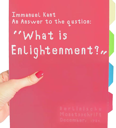
When reading the text: An Answer to the question: “What is Enlightenment?”, by the Philosopher Immanuel Kant, I found the copy I had hard to follow. I felt Inspired to think of ways I could adapt the text to make the it “Dyslexia friendly”.
I observed how a lot of dyslexia people gravitated o more creative fields, which is what inspired a huge part of my design.
Process book:


%20PNG.png)
Circles. I used coloured circles in my designs as indicators to where you can find that word in the glossary for example, A-F words are highlighted with a yellow circle and can be found on the yellow page in the glossary.
A-F = Yellow
G-L = Green
M-S = Blue
T-Z = Pink.
Each colour circled correlated with the coloured card where you can find the definition to the word you are having difficulty understanding. I printed the glossary on thicker loose sheets of card so that the reader can also use them as a further tool to help aid their reading by placing under the line you're reading as a guide, as dyslexic reader often have difficulty reading because they find they get lines mixed up and lose their place.
These pages glossary pages (cards) could also function as a bookmark.


